
Window Display Ideas: How to Plan Retail Windows and In-Store Displays That Sell
A window display is a three-dimensional scene built inside the glass at the front of a store. Its job is to stop a passerby, show what the shop sells, and pull that person through the door. An in-store display does the same work deeper on the selling floor, where it points shoppers toward hero pieces and complete outfits rather than toward the store itself. This page is the cornerstone guide for the window display ideas covered across our retail display library: what the glass has to do in the first three seconds, how to plan a change, which mannequin form fits the job, how much of the shop to reveal behind the glass, how to light and color it, how often to rebuild it, and how to tell whether any of it actually earned its keep. Each section also links to a deeper article on that single piece of the work.
What is a window display, and how is it different from an in-store display?
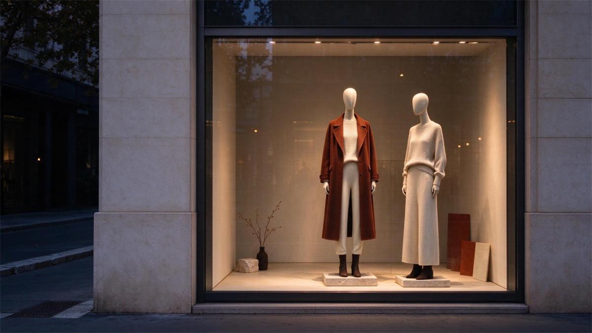
A window display is a staged scene behind the front glass of a shop, built to be read from the sidewalk in a few seconds. An in-store display is any staged presentation inside the shop, built to be read at walking pace and from several angles. The two share materials and a visual language, but they fail for different reasons. A window fails when it cannot be understood at a distance. An in-store display fails when the shopper walks past it without slowing down.
Keeping the two straight is what turns a list of window display ideas into a plan a shop can run every month. The practical difference shows up in how much each one can say. Glass compresses everything: you get one idea, one focal point, and one reading distance. The selling floor gives you more room, so in-store displays can carry size runs, price points, and styling notes that would be noise in a window.
| Dimension | Window display | In-store display |
|---|---|---|
| Viewing distance | 3–15 m, behind glass | 0.5–3 m, shoppers can walk around it |
| Reading time | About 2.6 seconds to form a first impression | Tens of seconds, and shoppers can circle back |
| Allowed information load | One theme, one focal point | Theme + sizes + outfitting + prices |
| Primary metrics | Dwell time and walk-in conversion (capture rate) | Touch rate, fitting-room traffic, add-on sales |
| Common failure mode | Too crowded; unreadable in 3 seconds | Disconnected from traffic flow; nobody passes it |
| Refresh cadence | Full window refresh every 2–4 weeks | Partial tweaks timed to arrivals and promotions |
Both matter, and they work best when the window makes a promise the floor keeps. If the glass shows a cream knit and the shopper has to hunt for it, the window did its job and the floor lost the sale. If you want the floor-side detail, our guide on how to present garments that sell inside a clothing boutique goes deeper on that half of the job.
Why do window display ideas still pay for themselves in 2026?
Because the walk past your front glass is still the lowest-cost advertising a physical shop owns, and the money moving through the peak season is still large enough to justify the labor. Deloitte projects U.S. holiday retail sales of $1.70 trillion to $1.71 trillion across November 2026 through January 2027, up 4.0% to 4.8% from a year earlier, with e-commerce at $316.1 billion to $318.9 billion (Deloitte, Sept. 10, 2026). Online keeps growing faster than stores, which is exactly why the glass has to do what a product page cannot: show scale, fabric, and how an outfit sits on a body.
Shoppers also start earlier than most merchandising calendars assume. In NRF's 2026 Halloween survey of 7,889 consumers, 49% said they began Halloween shopping in September or earlier, against 34% a decade earlier, and 74% planned to celebrate (NRF). A window that changes on the old schedule, Halloween up on October 20 and down on November 1, now meets a shopper who has been buying since early September and will still be buying in November.
There is a behavioral ceiling worth knowing too. Footfall analytics puts the first-impression window at 2.6 seconds, with a healthy capture rate (store entries divided by passersby) between 5% and 10%, and treats a stop longer than five seconds as intentional interest rather than a habitual two-second glance (Footfall, 2026). That is the whole brief: win 2.6 seconds, convert a few percent of the people walking past, and hold the ones you catch for more than five seconds. Window display ideas earn their keep when they are built for that sequence rather than for a pretty photograph in a lookbook.
How do you turn a blank window into a finished display in seven steps?
Work in a fixed order so the window is a repeatable process instead of a monthly argument. The order below is the one most shops can run in a single evening with two people.
Pick the one idea first. Write it as a sentence a stranger could repeat: "the coat that works for a wet November."
Choose the merchandise second. One hero piece, two to four supporting pieces, and the accessories that make the hero buyable.
Choose the form that carries the hero. Full body for a complete look, a dress form for construction and tailoring, a head or torso form for accessories.
Set the composition on the floor before anything goes on the form. Height, depth, and negative space cost far less to fix at this stage.
Set the color story to three to five colors, then remove anything outside it.
Light it last, from the street. Stand on the sidewalk, not in the window.
Photograph it, write the change-over date on the calendar, and set the next review.
The step most shops skip is number seven. Without a date and a photo, you cannot tell which windows worked, and every rebuild starts from opinion.
Which mannequin should be the hero of your window?
Match the form to the selling job, not to what is currently in the stockroom. A full-body form sells an outfit and a silhouette. A dress form sells cut, construction, and fit. A torso or head form sells accessories, and it lets you put six products where one full body would fit.
| Merchandising task | Recommended form | Why it works | Common styling mistake |
|---|---|---|---|
| Full outfits / coats / dresses | Full-body mannequin (posed) | Shows fit proportions and drape | Half-dressed; an empty lower half reads as stock |
| Tailoring / couture / knitwear / bridal | Dress form | Highlights construction and craft with no facial distraction | Stock piled around it kills the focus |
| Hats / scarves / jewelry / eyewear | Head form or bust display | High density; works in groups | Lined up in a row with no layering |
| Kidswear and parent-child lines | Children's mannequin (size by age) | Scale matches the real wearer | Substituting a scaled-down adult mannequin |
| Plus-size and inclusive displays | Plus-size full-body mannequin | Lets target customers see themselves | Small sizes only plus a text note |
Getting the size right matters more than getting the pose right. A form that runs two sizes smaller than your real customer makes the garment look wrong on the body it is meant for. Our pillar guide on choosing mannequins by size, style, and display fit covers the measurement sequence, and the mannequin size chart with standard measurements gives you the numbers to check against your own sales data. For a form-by-form comparison, see the main types of mannequins used in retail display.
If the hero is a full look, the styling details decide whether it reads as fashion or as laundry. Pin and clip so the garment fits the form, dress head to toe, and give the eye a second stop at the neck or waist. That process is broken down in how to style a mannequin for a boutique. For tailored pieces, a dress form display will usually outsell a mannequin, and if your customer base is not sample-sized, a plus-size form in the window is not a nice gesture, it is a sales tool.
How transparent should a window be?
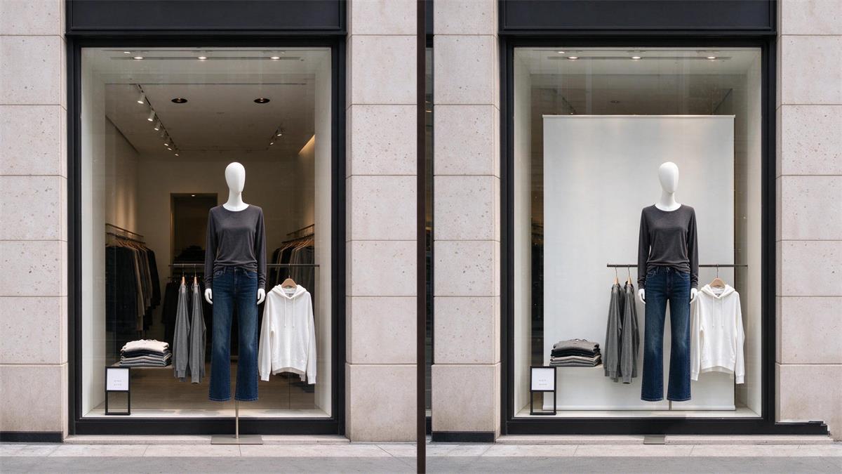
More transparent than most shops dare, as long as what is behind the glass is worth seeing. A peer-reviewed study by Kalantari and colleagues, published in the Journal of Retailing and Consumer Services in 2022, used virtual reality to change only the transparency of a storefront while holding everything else constant. Highly transparent windows produced higher attractiveness ratings and longer observation times, and the effect ran through a reduction in perceived visual complexity and an increase in feelings of pleasure (Cornell DAIL, study summary). The study did not find a significant difference in approach behavior, and the authors note that may be because participants knew they could not actually walk into a virtual store.
Read that as a design instruction, not a rule to follow blindly. See-through glass reduces the unknown, and an unknown window reads as risky. What you must not reveal is the back of house: stock cages, a staff desk, or a fitting room door. Fix the interior sightline before you open the view.
| Window type | Transparency | Best fit | Build effort | Risk |
|---|---|---|---|---|
| Open-back | High; sightlines run into the store | Lifestyle stores with attractive interiors | Low | A cluttered backdrop ruins the display |
| Semi-closed | Medium; partially screened | Small boutiques that change themes often | Low to medium | A badly placed screen blocks the focal point |
| Closed-back | Low; solid backdrop | Luxury goods; single-product focus | Medium | Loses the appeal that transparency earns |
| Shadow box | Low and shallow | Accessories, jewelry, small goods | Low | Shallow depth can look thin |
Transparency also removes the places you can hide things. A fully open window takes away the messy middle ground, so decide first whether the floor behind the glass looks presentable at nine in the morning. If it does not, close the back and win the effect with a clean, light-colored panel instead. Shops that cannot keep the interior tidy get more from a controlled background than from borrowed depth. The trade-off is worth naming: you give up some of the see-through benefit measured in the Cornell study in exchange for a window that never shows a stock cage.
Small shops win most often with the semi-closed format: one clean wall or panel behind the hero, so the window reads as intentional and the shop behind still gets some light and visibility. The boutique window display playbook works through that layout in more detail, including what to do with a narrow frontage.
How do you write a brief for a window display idea?
Write it on one page. A brief is what lets somebody else build the window without calling you, and it is the difference between a display that gets finished on a Tuesday morning and one that turns into a three-hour debate in front of the glass.
Six fields cover most windows. If a field is hard to fill, the idea is not finished yet.
| Brief field | What good looks like |
|---|---|
| One-sentence concept | A stranger could repeat it, such as "the coat for a wet November" |
| Hero SKU | One piece, in stock, findable on the floor in under a minute |
| Supporting pieces | Two to four items plus the accessories that make the hero buyable |
| Carrying form | Full body, dress form, or head form, with the size written down |
| Palette | Three to five colors, with the dominant and accent named |
| Install and review dates | Two real dates, with the review within seven days of install |
The field that saves the most money is the review date. Without it, a window that quietly underperforms stays up for a month because nobody booked the time to look at it. With it, you get a decision in week one and a fix in week two, and you start the next change with evidence instead of opinion.
How do color and lighting change what a shopper sees?
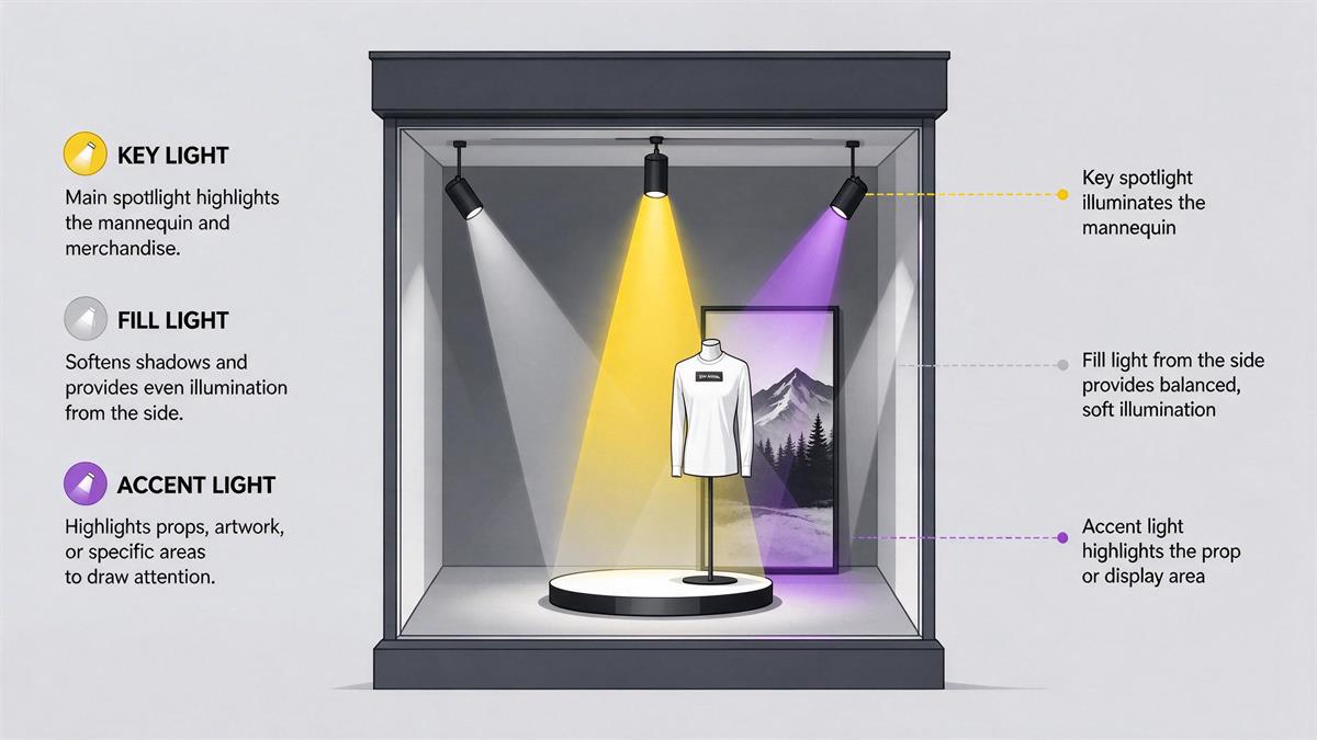
Color tells the shopper what kind of shop this is, and lighting decides whether they can see the product at all after dark. Keep the palette to three to five colors and let one of them dominate. A useful default for apparel is a 60/30/10 split: 60% dominant base color, 30% secondary, 10% accent that draws the eye to the hero.
Lighting works in three layers. A key light on the hero, a fill light so shadows on the garment do not go muddy, and an accent on a prop or a sign. Single overhead panels flatten fabric and make color read grey, which is why a well-aimed track light usually beats a brighter ceiling.
| Lighting layer | Role | Typical color temperature | How to check it |
|---|---|---|---|
| Key light | Lights the focal point and creates contrast | 3000–3500 K warm white (apparel) | From the sidewalk, check for one clear bright spot |
| Fill light | Lifts harsh shadows | Same as the key light or slightly lower | Check whether face and cuff shadows still show detail |
| Accent light | Picks out props, signage and accessories | Slightly warmer or tinted | Check whether it steals attention from the hero piece |
Both topics are deep enough to have their own guides. For beam angles, color temperature, and the day-to-night switch, see window display lighting that sells. For palette choices by season and by product, see retail color psychology for window displays.
What should the signage in a window say?
One thing, in as few words as possible. Window signage is read at a distance and at an angle, so a line that works on a poster usually fails on glass. Seven words is a working ceiling for a main line, and a price or a date can carry the second line.
Test legibility the quick way: photograph the window from across the street, then read the photo on a phone held at arm's length. If you have to zoom in, the type is too small. Place signs at standing eye level rather than at the top of the glass, and keep them out of the focal point unless the sign is the focal point.
| Sign type | Best use | Common error |
|---|---|---|
| Theme line (seven words or fewer) | Seasonal or concept windows | Copying the full campaign slogan |
| Price or offer card | Promotional windows | Left up long after the offer ends |
| QR code | Linking to the exact outfit or lookbook | Linking to the homepage, which converts nothing |
| Maker or material note | Craft, local, or fabric stories | Too small to read from the sidewalk |
A QR code only earns its place when it resolves to the product in the window. A code that opens a homepage gets scanned once and never again, and it costs you the attention of the person who tried.
How many items belong in one window?
Fewer than you think, and the number should follow the width of the glass rather than the number of things you want to sell. Crowding raises perceived visual complexity, and the Cornell study above links lower complexity to longer looking. A window the eye cannot decode in under three seconds loses the passerby entirely. Most window display ideas that fail on the street fail here, not because the product was wrong but because there was too much of it.
| Window width | Full-body mannequins | Support props | Negative space |
|---|---|---|---|
| 1.0-1.5 m | 1 | 1-2 | Keep at least 30% of one side clear |
| 1.5-2.5 m | 1-2 | 2-3 | Leave one open corner on each side of the focus |
| 2.5-4.0 m | 2-3 | 3-4 | Keep a clear sightline band through the middle |
| Over 4.0 m | 3-4 | 4-6 | Zone by group with one focal point per group |
Work in odd numbers of elements, because three reads as composed in a way that two or four does not, and stack heights so the eye travels down a clean diagonal. The smallest or most wanted piece goes highest.
What window layout works in a small or narrow shop?
Use one of three formats and stop improvising: an open-back window that sells the whole shop, a closed-back window that isolates a hero, or a semi-closed window that gives you a clean background with a fast change-over. Narrow fronts almost always do better with closed-back or semi-closed, because there is no depth to build a scene in and whatever is happening behind the glass becomes part of the composition.
Small shops also win by changing the story rather than the inventory. A single hero outfit styled for three different occasions is three windows' worth of interest out of one rack. The boutique playbook has a budget-by-budget version of this, and how to choose a boutique mannequin by store type covers the form side of a small floor plan.
How often should you change a window display?
Often enough that the same commuter sees something new, which for most high-street shops means a light touch every one to two weeks and a full rebuild every two to four weeks. The old rule of one change per season no longer matches how people shop: with 49% of Halloween shoppers starting in September or earlier, a seasonal calendar that turns over four times a year is running behind its own customers (NRF).
| Cadence tier | Frequency | Actions | Time required |
|---|---|---|---|
| Micro-tweak | Every 1–2 weeks | Swap accessories, adjust poses, rotate signage | 15–30 minutes |
| Full window change | Every 2–4 weeks | New theme, new hero product, new palette | 2–4 hours (two people) |
| Calendar switchover | On the retail calendar | A full swap for a holiday or promotional theme | Half a day to a full day |
| Review | After every change | Photograph it, log the date, compare walk-in data | 20 minutes |
Do not measure a change by gut feel. Run it as a test: same window position, same week pattern, minimum 14 days so you cover two full weekend cycles, then compare the capture rate and dwell against the previous window (Footfall, 2026). Change one variable at a time where you can, otherwise you will not know which change did the work.
Reusable props are the most affordable way to keep this cadence. A crate, a neutral fabric panel, two risers, and a clip light will carry most themes for a year, and it keeps seasonal sets out of a landfill. NRF's 2026 data shows 34% of shoppers respond to higher prices by looking for items they can re-use in future years, so a prop library is both a budget decision and a message customers notice.
How do you plan window display ideas around the retail calendar?
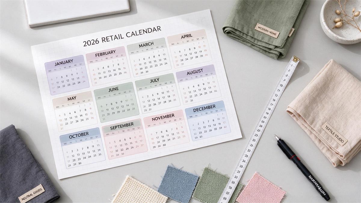
Work backwards from the week the shopper starts buying, not from the date on the calendar. Dating window display ideas to the holiday itself rather than to the buying curve is the most common planning error in seasonal calendars. The table below starts from October 2026, because that is where the current season stands.
| Month | Retail moment | Window action | Read more |
|---|---|---|---|
| October | Halloween (underway) | Wind the theme down and prep a front-layer swap for early November | Halloween retail display ideas |
| Early–mid November | Thanksgiving gap | Bridge with color and texture; do not jump to Christmas early | Thanksgiving window display ideas |
| Late November | Black Friday / weekend traffic | A front-layer swap is enough; keep the structure and flow | Black Friday visual merchandising |
| December | Christmas and holiday peak | The main stage of the year; prioritize lighting and the night view | Christmas window display ideas |
| Late December – February | Long winter cycle | A base that lasts three months, refreshed with color swaps | Winter window display ideas |
| January | Clearance and reset | About 70% regular display plus 30% clearance zone | See the winter guide |
| March–May | Spring and Easter | Line up themes and props 6–8 weeks ahead | Holiday retail display calendar |
| July–August | Back-to-school | Be fully set by the first week of August | Back-to-school window display ideas |
| September–October | Fall transition | Lead with a fall palette and layering | Fall window display ideas |
The full twelve-month view, including how far ahead to brief a theme, sits in our visual merchandising calendar for the 2026 season.
How do you keep a window display safe and stable for a full season?
Treat stability as part of the design, because a window sits unsupervised for weeks at a time. Every standing form should sit flat, with even contact between the base and the floor, and any form placed on a riser should be tested with a gentle push at shoulder height before you walk away. Tall forms close to the glass are the ones that fail, since a shopping bag or a running child can reach them from the street side.
Heat and cables cause the other two recurring problems. Direct afternoon sun raises the temperature at the glass line, which fades fabric and warps some props over a long run, so leave a small air gap between the glass and anything hanging against it. Run cables along the window frame instead of across the floor, and fix them down where they cross the path staff use to reach the lights. Then book a five-minute check every week: glass clean, lights working, no leaning forms, no loose tape. Window problems are almost always slow, and a weekly look catches them while they are still small.
How do you make a window people photograph and share?
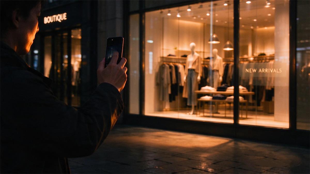
Build for the camera, because a shared window is free reach and a photographed window is a sign the composition has one clear subject. A useful test for any set of window display ideas is whether somebody would stop and photograph it on the way past. One hero, one light, and one empty area will photograph well on a phone. Six products at even height will not.
Give the shot a reason to exist. A strong color field, one oversized prop, or a moment a shopper recognizes will do it. Add a small QR code linking to the exact outfit if your site can support it, and keep the glass clean, because fingerprints show up in photos at full size. Shoot a vertical 1000x1500 frame for Pinterest and a 1200x675 frame for LinkedIn or your own site, and take both the same evening while the display is fresh.
How do you measure whether a window display worked?
Compare each window against your own baseline, not against a number you read online. Vendor statistics about displays lifting sales by a fixed percentage rarely publish their method, and they are not a fair benchmark for your street. What you can measure reliably is the funnel in front of your own door.
| Metric | How to measure | What good looks like | Frequency |
|---|---|---|---|
| Passerby traffic | Door counter or manual sampling counts | Build your own baseline | Ongoing |
| Capture rate (walk-in rate) | Walk-ins ÷ passersby × 100 | 5–10% is a common healthy range | Weekly |
| Dwell time | Sample observations; count stays over 5 seconds as genuine interest | A rising share of intentional stops | Every window change |
| Featured product sales | Compare two weeks before and after featuring the product | Sales of the featured item rise after the display goes in | Every window change |
| A/B results | Run a full 14 days in the same spot before comparing | The difference exceeds day-to-day noise | At least once a quarter |
| Social exposure | Photo shares and tag mentions | A source of photo traffic you can attribute | Every window change |
Start by measuring what you already have. Two weeks of passerby counts and entry counts, taken in the same time blocks on the same weekdays, is enough to set a baseline, and without it no later comparison means much. Shops with no door counter can sample instead: one person, four 15-minute blocks spread across a week, repeated in the same slots after each change.
The number that matters most is the delta. A window that lifts capture rate from 6% to 8% on your street is a 33% improvement in the thing the glass is paid to do, and that is worth more than any industry average in a blog post.
What are the most common window display mistakes?
Most bad windows fail for one of five reasons, and all five are visible from the sidewalk in under a minute.
| Mistake | Symptom | Fix |
|---|---|---|
| Too crowded | No readable focus within 3 seconds | Cut back to one focal point and 3–5 products |
| Flat lighting | Gray at night; fabric loses all texture | Add a key light and switch off the floodlit ceiling wash |
| Half-dressed mannequins | Looks like stock, not styling | Full head-to-toe looks complete with shoes and bags |
| No change date | Untouched for three months | Lock window-change days into the calendar |
| Dirty glass and floor | Handprints all over every close-up | Add a cleaning step to the window-change routine |
If the next window needs a different hero form, the fastest place to start is the female mannequins, male mannequins, kids mannequins or dress forms collections. If you are rebuilding a full seasonal window and want a second opinion on the layout before install day, send us your window dimensions and a photo and we will work through it with you.
About the Author
Brook Chen is a Visual Merchandising Specialist at awmannequins.com. With over 8 years of experience designing window and in-store displays for retail brands across the US, Canada, and Australia, she helps boutiques and stores translate seasonal concepts into store-ready merchandising.
Frequently Asked Questions
How many mannequins should a small shop put in one window?
One for a window under 1.5 meters wide, two for windows between 1.5 and 2.5 meters. The constraint is not what you own, it is whether a passerby can identify the hero piece in about three seconds. If two forms make the window read as a rack, go back to one and put the second supporting product on a riser.
How much does a retail window display cost?
A refresh using stock you already own and a reusable prop kit costs only labor. A full theme build with new props, signage, and lighting typically runs into the low hundreds of dollars for an independent shop. The recurring cost that matters is staff time, which is why a documented two-hour change-over routine beats a bespoke build every month.
What color or finish should a display mannequin be?
Neutral finishes keep the garment as the hero and survive more seasons than painted or flesh-tone forms. Choose a skin tone or finish only when the brand story depends on representation or on a specific palette. Matte finishes photograph better under strong light; gloss reads as hard and throws reflections through glass.
How far ahead should you plan a holiday window display?
Six to eight weeks before the shopping moment, not before the holiday itself. NRF's 2026 Halloween survey found 49% of consumers begin buying in September or earlier, so a window built for the date rather than for the buying curve arrives late. Brief the theme eight weeks out, build props four weeks out, and install two weeks before peak.
Do window displays still work when most shopping happens online?
Yes, and the two channels are doing different jobs. E-commerce is growing faster than stores this season, with Deloitte forecasting holiday online sales up 7.5% to 8.4%, but a window still shows scale, drape, and fit that a product page cannot. The window's job has shifted from closing the sale to creating the visit and the photograph that starts the online journey.