

Retail Color Psychology: Window Display Colors That Sell
Retail color psychology is the study of how color in a storefront changes what a shopper notices, feels, and does before they read a single price. In window display work it comes down to three practical decisions: which hue dominates the glass, which tone supports it, and which one accent you spend on the message that matters this month. Get those three right and a small boutique can hold its own against a department store block. Get them wrong and a well-built display reads as clutter from across the street. There is no universal color chart worth memorizing, because the same red that signals a bargain in a discount aisle signals something else entirely in a bridal window. What follows is how the effect actually works, which palettes fit which retail moment, and how to test a scheme before you build it.
What is retail color psychology?
Retail color psychology is the practice of choosing display color by how shoppers interpret it in context, rather than by a fixed list of meanings attached to each hue. It treats color as one cue among several that are working at the same time, alongside the lighting, the merchandise, and the form wearing it.
That distinction matters because most of the advice published on this topic is a lookup table. Red means urgency. Blue means trust. Yellow means optimism. Those associations are real, but they are also fragile. A 2026 meta-analysis published in Acta Psychologica Sinica pooled 51 studies and 156 effect sizes and found that blue held a small positive advantage over red on consumer attitude (r = 0.11) and an even smaller one on behavior (r = 0.08), with the attitude effect consistently larger than the behavior effect (Acta Psychologica Sinica, 2026). Read that honestly and it says something useful: color moves people, but modestly, and it moves how they feel about a store more than what they put in a basket.
So the working principle for a display is not "find the converting color." It is "remove the competition." Color is at its most effective when it makes one thing obvious and everything else quiet. A shopper walking past a shop has a few seconds of attention, and a palette that asks them to process five competing stories in that window will lose to a palette that asks them to process one.
The second principle is that color is contextual in a way that punishes copying. A deep burgundy backdrop that reads as expensive against a matte form can read as dated against a glossy one, and the same accent that works on a brightly lit high street can disappear on a shaded side street. Color decisions have to be made against the window you actually have.
What do the main colors actually do in a store display?
They set the emotional register of the window and decide which object the eye lands on first. The associations below are the ones that hold up well enough in Western retail to plan around, provided you treat them as tendencies rather than rules.
| Color | What shoppers tend to read | Best display job | Watch out for |
|---|---|---|---|
| Red | Energy, urgency, appetite, sale | Clearance windows, food and beauty, a single promo callout | An entire window in red flattens into noise and reads aggressive |
| Orange and amber | Warmth, friendliness, value | Autumn and Halloween windows, mid-price apparel | Skews juvenile if it covers the whole window |
| Yellow | Optimism, visibility, alert | Small accent on a new-arrival or price sign | Large yellow areas read grocery, and it fatigues fast |
| Green | Freshness, calm, nature, health | Skincare, wellness, outdoor and garden lines | Deep green indoors can go cold without warm light |
| Blue | Trust, calm, reliability | Denim, menswear, sportswear, anything considered | Signals "browse slowly," so it fights urgency messaging |
| Purple and violet | Creativity, premium, occasion | Eveningwear, gifting, Halloween as a secondary tone | Reads costume if paired with orange at full strength |
| Off-white and cream | Clarity, premium neutrality, space | Base layer of almost any window, product hero backdrops | Needs texture or a shadow to avoid looking unfinished |
| Black and charcoal | Sophistication, focus, authority | Luxury and minimal fashion, product framing | Absorbs light, so it needs dedicated spot lighting |
| Warm neutrals (clay, camel, sand) | Grounded, considered, seasonal | Fall and winter bases, tonal merchandising | Can read flat next to strong logos or busy packaging |
| Metallic (gold, chrome) | Occasion, gift, premium cue | Holiday, jewellery, accents on plinths and rails | Reflective surfaces double every color you place near them |
Two patterns run through that table. The first is that warm colors raise the energy of a window and cool colors lower it, which is why a warm palette suits a promotion and a cool one suits considered purchase. The second is that saturation does more work than hue. A muted terracotta and a fluorescent orange are both "orange" and they behave nothing alike at ten paces. When a window feels shouty, the fix is usually saturation rather than hue.
The practical habit worth building is to look at your window from across the street, not from inside it. Color decisions that look balanced at half a meter of viewing distance often fail at fifteen, and the pavement view is the only one your shoppers will ever use.
How do you build a window palette that reads from the pavement?
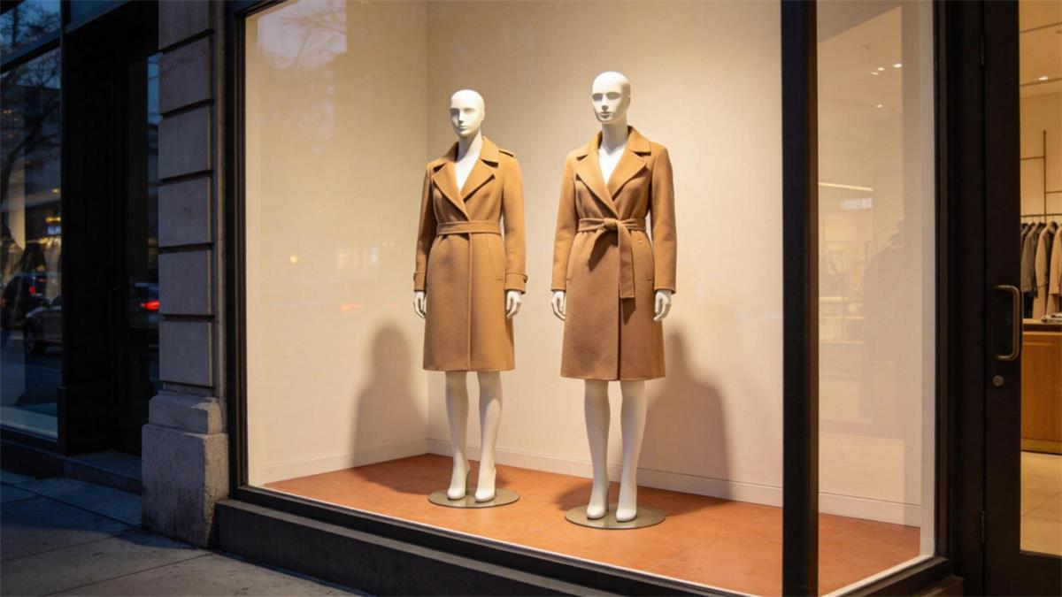
Build it around three roles rather than a mood board. A window that names its dominant tone, its supporting tone, and its single accent has already solved most of its composition problems, because the roles decide how much of each color is allowed into the glass.
| Role | Share of the window | The job it does | Example |
|---|---|---|---|
| Dominant | Roughly 60 percent | Sets the season and the mood from the street | Deep cream backdrop wall with a clay floor |
| Supporting | Roughly 30 percent | Carries the merchandise and the forms | Camel outerwear, natural wood plinths |
| Accent | Roughly 10 percent | Points at the one message you want read first | A single oxblood scarf and a matching price card |
The accent is the one most stores get wrong, usually by giving it too much space. An accent works precisely because it is scarce. If the accent color appears on three props, two signs and a rug, it stops being an accent and becomes a second dominant tone, and the window loses its focal point.
There is a second, less obvious member of the palette: the form itself. A white or abstract mannequin is effectively the window's white space and can be left out of your color count. A realistic form in a skin tone adds a fixed warm hue that you cannot change week to week, so it has to be counted as one of your three colors. A window with a natural-tone form, a cream wall and two bright props is already a four-color window before you have styled anything.
If you want a reason to plan palettes rather than buy them fresh each season, the consumer data gives you one. In this year's National Retail Federation Halloween survey, 34 percent of shoppers said they would look for items they can reuse in future years or repurpose for other occasions (NRF, September 2026). Retailers can take the same logic into their own windows. A repaintable neutral base of plinths, panels and risers in one off-white lets the accent color do the seasonal work, which means a single set of props can carry a Halloween window, a holiday window and a January reset with nothing more than a change of accent and a couple of new surfaces.
Which palette fits which season and retail moment?
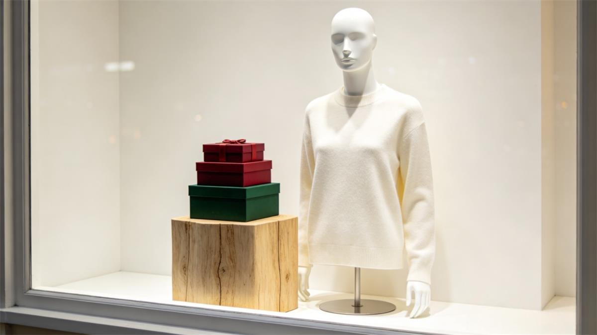
The palette should follow the trading calendar, because shoppers read color against the season they are already living in. The moments below are sequenced by when a display team actually builds them, which is always weeks ahead of the calendar date.
| Window moment | Dominant | Support | Accent | Why it works |
|---|---|---|---|---|
| Halloween (late September to October 31) | Black or charcoal | Deep orange, warm brown | Violet or bone white | Keeps the seasonal read from turning into a novelty aisle, and holds up for a full season rather than one night |
| Late fall (November 1 to mid November) | Warm neutral, clay | Camel, oatmeal, walnut | Oxblood or forest green | Bridges the gap between Halloween and holiday without leaving the window empty |
| Holiday (mid November to December) | Off-white or soft cream | Warm metallics, natural wood | One saturated brand color | An off-white base lets one strong accent carry the brand, which photographs far better than a fully decorated window |
| January reset | Cool white or pale grey | Light wood, clear acrylic | Pastel or one bright primary | Signals new season and clearance without repeating December |
| Spring (February to April) | Soft white | Sage, blush, pale sand | Fresh green or butter yellow | Reads as renewal from a distance and flatters light apparel |
| Summer (May to August) | Bright white | Natural linen, rattan | Turquoise or coral | High-key white with one saturated accent reads clean in strong daylight |
The Halloween row is doing more work than it used to. Consumer spending on the holiday is expected to reach 13.5 billion dollars this year, with 74 percent of shoppers planning to celebrate and 49 percent starting their shopping in September or earlier (NRF, September 2026). A window that was once a one-night costume cue is now a season that has to stay interesting for five or six weeks, which is an argument for a restrained black, orange and violet palette over a prop-heavy scene.
The holiday row has a 2026 answer worth knowing. Pantone named Cloud Dancer (PANTONE 11-4201) as its Color of the Year for 2026, describing it as a weightless off-white that offers "a promise of clarity" in a period of overload (Messe Frankfurt, 2026). For a boutique window that is genuinely useful, because it confirms what display teams have been drifting toward for several seasons: an off-white base with one saturated accent reads more premium, and photographs better for social, than a window packed with holiday red and green. For context on how much is riding on the quarter, NRF projects US retail sales to grow 4.4 percent in 2026 to 5.6 trillion dollars, with the holiday window still doing first-line selling work in physical stores (NRF, 2026).
How do mannequin finish and skin tone interact with your palette?
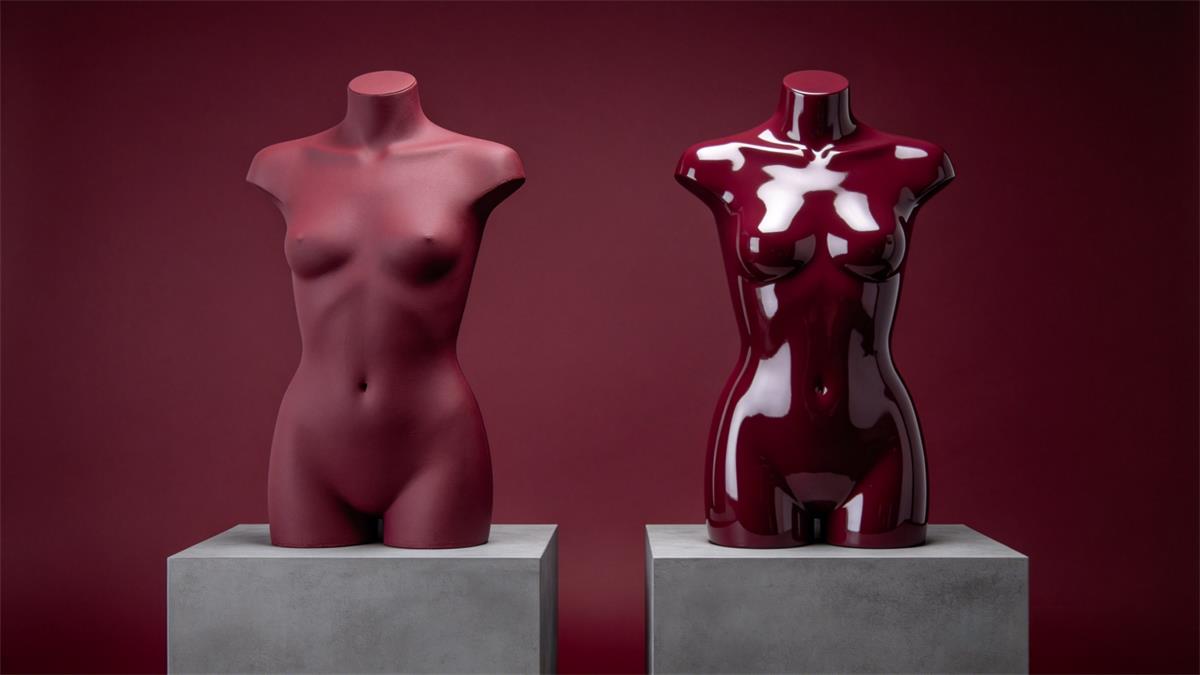
They change how every other color in the window behaves, which is why they should be chosen as part of the palette rather than after it. Finish decides whether the form mirrors its surroundings or separates from them, and skin tone decides what permanent hue is already sitting in the composition.
| Form type or finish | How it reads against color | Best for | Watch out for |
|---|---|---|---|
| Matte painted finish | Absorbs light, holds a clean silhouette, separates from a busy backdrop | Color-heavy windows, strong accent palettes, photography | Can read flat in low light, so it needs directional spots |
| Gloss or high-shine finish | Reflects the street, the floor and neighbouring colors | Tonal, minimal windows where the form is the subject | Doubles every color nearby, which makes accent control harder |
| White or off-white form | Acts as built-in negative space | Any window with a busy product story | Can disappear against a white wall without a shadow or edge |
| Abstract or egg-head form | Neutral, low-distraction, reads as design rather than person | Product-led windows, and any palettes you rotate often | Adds no warmth, so a cool palette can go clinical |
| Realistic form in a skin tone | Introduces a fixed warm hue you cannot restyle | Brand cohesion, inclusive merchandising, lifestyle styling | Counts as one of your colors and must be repeated elsewhere in the palette to feel intentional |
| Dress form or torso | Concentrates attention on construction and fabric | Tailoring, bridal, knitwear, detail-led product | Reads as workroom rather than lifestyle, so pair with finished looks |
The most useful rule in that table is the finish rule. A matte form is the safer choice for a color-led window, because matte surfaces let you control how much of each color registers. Gloss is better when you want the entire window to feel like one material, but it makes an accent color much harder to place, since a reflective form will pick up the backdrop, the floor and whatever is happening on the street outside.
Skin tone works the other way. Because it is fixed, it has to be echoed. If one form in a three-form grouping carries a deeper skin tone and nothing else in the window shares that warmth, the grouping reads as mismatched rather than deliberate. Carry the same warmth into a wooden plinth, a terracotta sign card or a camel garment and the same arrangement reads as intentional. This is also why inclusive merchandising works best inside one visual family rather than as a single token form: finish, palette and styling have to agree across every form on the floor. If you are still working out how many forms of each style a small floor actually needs, the mannequin size chart and fit guide covers the measurements, and how to choose the right form for your store covers the formats.
What are the most common color mistakes in store displays?
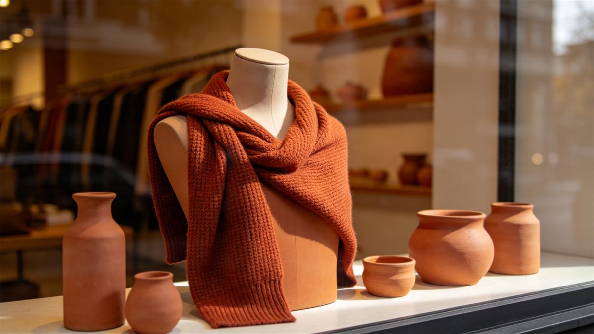
Most poor retail color decisions are not wrong colors. They are too many colors, in the wrong proportions, lit badly. The list below is the one worth pinning up during a changeover.
| Mistake | What the shopper actually does | Fix |
|---|---|---|
| Showing every color of the season at once | Scans the window, finds no entry point, keeps walking | Cut to one dominant, one support, one accent and move the rest inside |
| Using the accent as the dominant | Registers the prop or the sign instead of the merchandise | Cap the accent at roughly a tenth of the visible area |
| Warm palette under warm light | Everything blends into one muddy tone, product included | Pair a warm palette with a neutral or slightly cool key light |
| Ignoring the form's finish | The palette looks balanced in the plan and wrong in the glass | Decide matte or gloss before you commit the palette |
| Repeating the brand color everywhere | Reads as signage rather than as a display | Use the brand color as the accent, not the base |
| Matching the neighbouring storefront | Two windows become one visual block, and theirs is closer to the street | Check what your immediate neighbours are running before you build |
| Color planned only for daylight | The window dies at dusk, exactly when the street is busiest | Test the palette after dark and set the timer for it |
The through-line is restraint. A display that names its focal point and then removes everything that competes with it will outperform a display that adds. The instinct during a changeover is to add one more prop because the window looks bare. Most of the time, the window does not look bare. It looks clear, and clear is the thing that stops a shopper.
How do you test a palette before you commit?
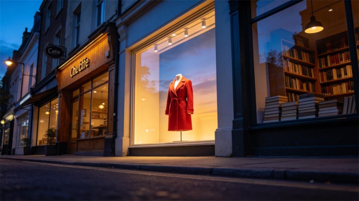
Test it in three passes over two weeks, and be honest about what the test can and cannot tell you. Nobody can isolate the effect of color from lighting, assortment and weather using a shop window, so the goal is to compare two full schemes rather than to prove a color converted anybody.
| Test | What it catches | Pass threshold |
|---|---|---|
| Ten-second pavement check | Whether the focal point reads from across the street | You can name the hero product and the message in under ten seconds |
| Phone photo at the pavement | Whether the palette survives a small screen, which is how most people will see it | Three colors or fewer are visible in the thumbnail |
| Night check | Whether the palette still separates once daylight is gone | The hero product is the brightest object in the window |
| Changeover photo log | Whether the palette is drifting across weeks | Every week's window matches the plan without late additions |
| Two-week before-and-after | Whether the window is doing its job at all | Door counts and hero-product sell-through compared against the previous two-week window |
Run the before-and-after in whole fortnights and change one thing at a time, because a scheme you swap after four days will tell you nothing. Log the four numbers you actually have: door count, hero-product units sold, staff hours spent on the changeover, and a dated photo. Over a season, that log becomes the most useful color record your store owns.
If you are building the window around a set of forms, it also helps to see the whole arrangement before you move a plinth. A virtual layout is low-cost to redo and takes a color decision out of the day-of-merchandising rush, which is the moment when most palettes quietly become five-color windows.
Ready to put a palette on your floor?
Start with the window you have to build next, name its dominant, support and accent, and decide the form finish before you commit either. Browse female mannequins, male mannequins, kids mannequins or dress forms, or talk to our team about specifying a form in a finish that suits the palette you already have. If you want the wider framework first, the complete window and in-store display guide covers composition, lighting and rotation in one place, and styling a mannequin that sells covers what to put on the form once the colors are set.
About the Author
Brook Chen is a Visual Merchandising Specialist at awmannequins.com. With over 8 years of experience designing window and in-store displays for retail brands across the US, Canada, and Australia, she helps boutiques and stores translate seasonal concepts into store-ready merchandising.
Frequently Asked Questions
What is retail color psychology?
Retail color psychology is the practice of choosing display and store colors based on how shoppers interpret them in a specific context, rather than applying a fixed meaning to each hue. In window display work it usually means deciding three things: the dominant color that sets the mood, a supporting tone that carries the merchandise, and one accent that points at the single message you want read first.
What colors attract customers to a store?
Warm colors such as red, orange and amber attract attention fastest, which is why they suit promotions and seasonal windows. Cool colors such as blue and green hold attention longer and suit considered purchases. The stronger effect, however, comes from contrast and restraint rather than from hue: a window with one clear accent stops more shoppers than a window in the loudest possible color.
How many colors should a window display use?
Three is the working number: a dominant tone covering roughly 60 percent of the window, a supporting tone at about 30 percent, and an accent at about 10 percent. Count the mannequin as part of the palette. A white or abstract form acts as negative space, but a realistic form in a skin tone adds a fixed warm hue that has to be echoed elsewhere or the grouping will look mismatched.
What is the best color for a retail window display?
There is no single best color, because the right choice depends on what the window is selling and when. Off-white and cream are the most reliable base colors, since they make merchandise stand out and photograph well, and Pantone named an off-white, Cloud Dancer, as its Color of the Year for 2026. Choose the accent by what the window needs to achieve this month, then keep it small.
Does window display color really affect sales?
Color affects shopper attention and attitude more reliably than it affects purchase. A 2026 meta-analysis of 51 studies found that blue held a small advantage over red on attitude and an even smaller one on behavior, which suggests color is a genuine but modest lever. Because lighting, assortment and season all move at the same time, the practical approach is to compare two complete palettes over whole fortnights rather than to test a single color in isolation.